SaaS Overhaul for Data Clarity
DASHBOARD REDESIGN
Point Spire's dashboards weren't working for either of the people who used them most. This project traces the path from feedback to heuristics to a redesign that made both users' daily work measurably easier.
Designer
Platform
Peter Piczon
Pointspire
Program
Customer
Supafrenz MDP Intensive
Aggreg8
ORK:
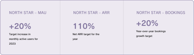
Target: 15% increase in user engagement — the current dashboard wasn't getting there for regular users or admins.
00
BUSINESS CONTEXT
A platform built for sensitive work, struggling with the everyday.
Point Spire helps public health agencies analyze sensitive data securely — healthcare organizations like Aggreg8 rely on it for data-driven decisions, tracking disease outbreaks, and running location-based analysis. The stakes of the work are high.
But the platform itself had a problem closer to the surface: neither the administrators managing it nor the end users working in it found the dashboard useful for their daily tasks. Engagement was flat, and the 15% OKR target was out of reach without a meaningful design intervention.
I joined the project through the Supafrenz Modern Product Designer Intensive, tasked with evaluating the current state and redesigning toward measurable improvement
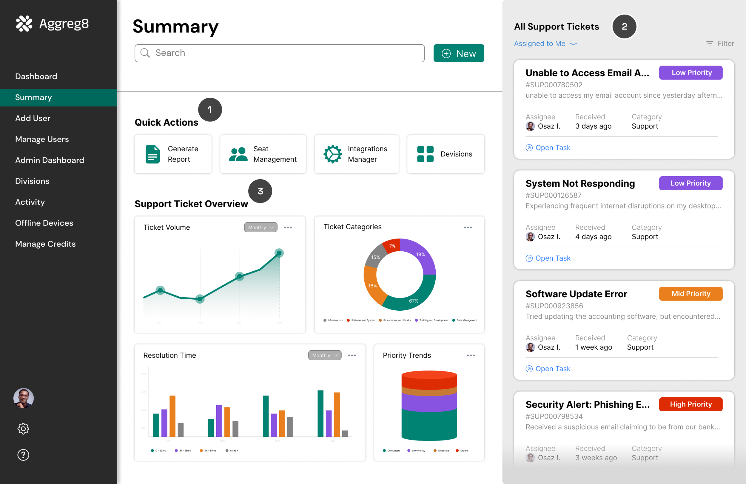
Osaz's Workspace View
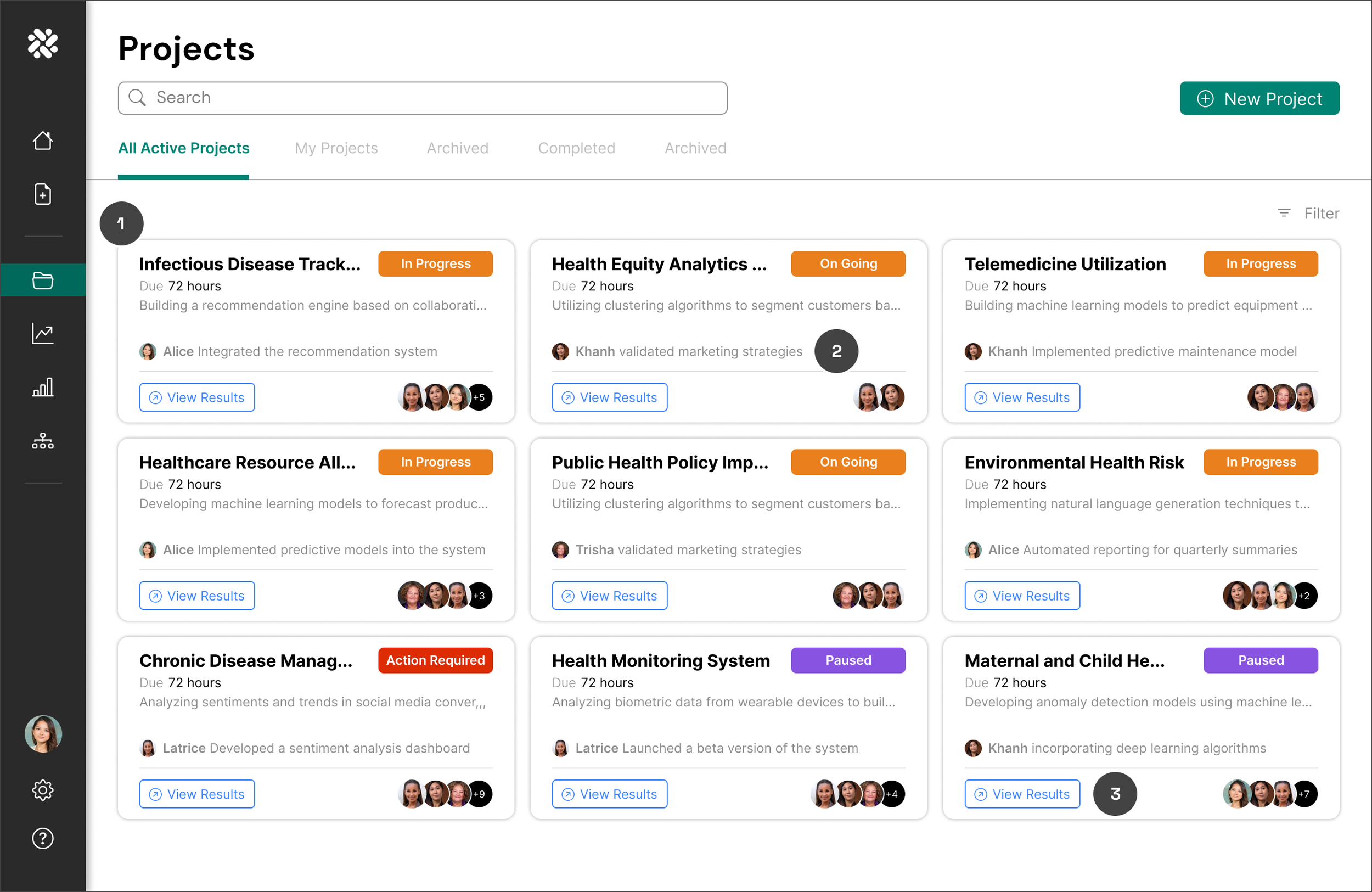
Alice's Workspace View01
REVIEWING FEEDBACK
I began with a heuristic evaluation, starting by reviewing existing feedback from the platform's two primary user types: an IT Administrator and a Primary End User. Rather than jumping to solutions, I mapped their behaviors and emotional responses to surface patterns connected to the dashboard experience.
What emerged was consistent: both users found Point Spire tedious and time-consuming in ways that were entirely avoidable. The friction wasn't inherent to the work — it was baked into the interface.
Two users. Same frustration. Different reasons.
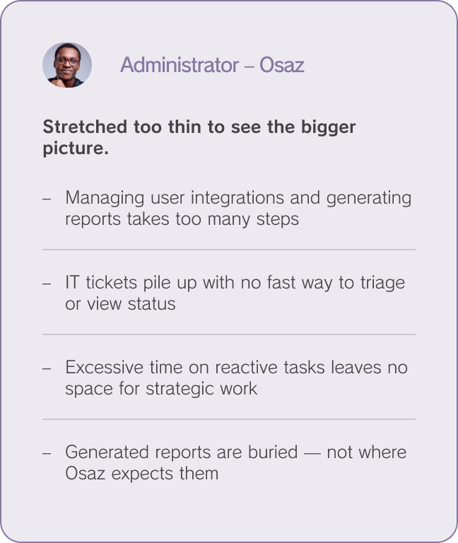
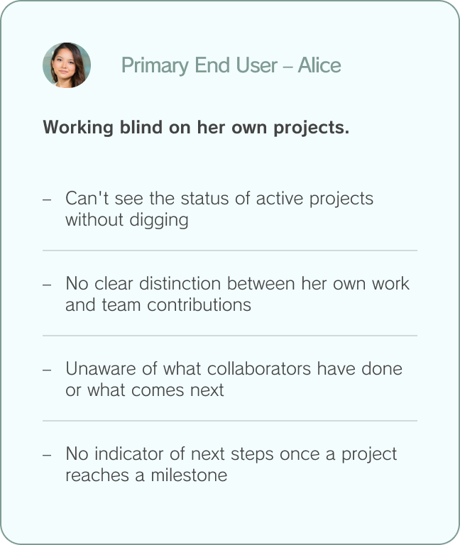
Both users struggled with the same underlying gap: the dashboard showed them data without context. It answered "what exists" but never "what matters right now" — and that gap was costing engagement every single day.
02
HEURISTIC EVALUATION
Evaluating against four principles.
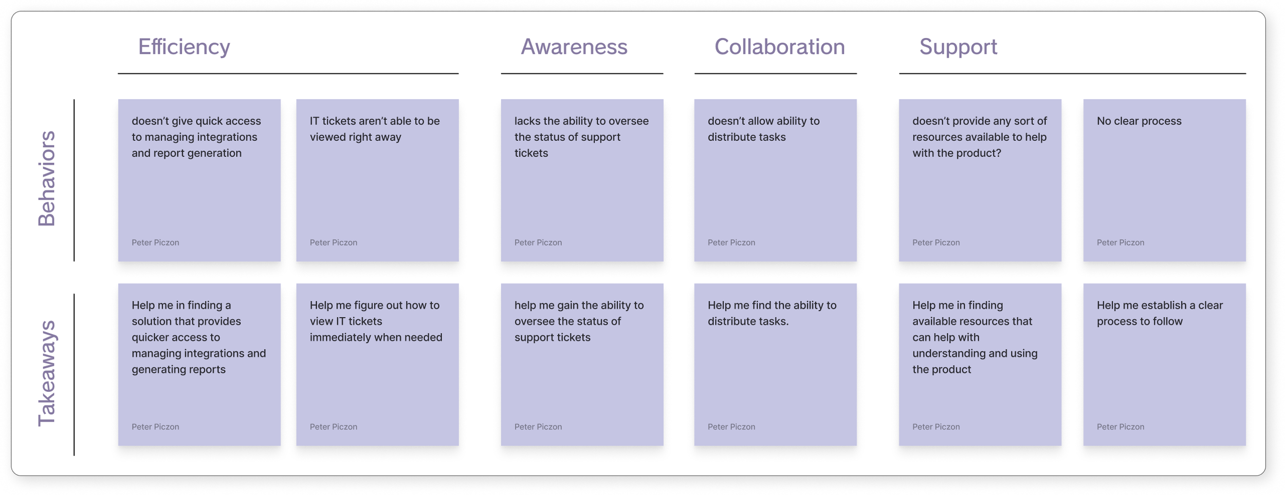
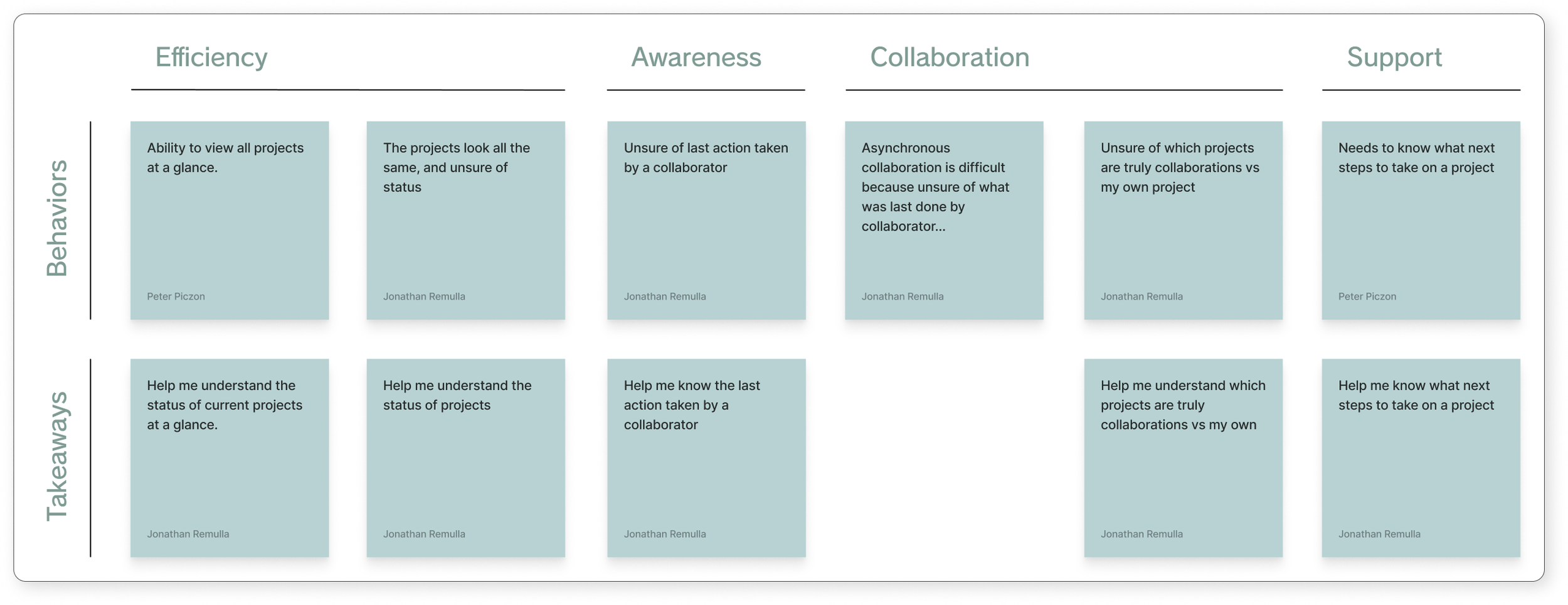
To move from user sentiment to design direction, I ran a structured heuristic evaluation of both dashboards across four lenses: efficiency, awareness, collaboration, and support. Each lens surfaced specific, addressable gaps.
This wasn't about cataloging every flaw — it was about identifying which problems were blocking the OKR. The evaluation made it clear that the highest-leverage issues weren't visual; they were structural. Users couldn't find what they needed, couldn't see what had changed, and couldn't act without leaving the dashboard to get context from elsewhere.
Osaz’s
Alice’s POV
03
DEFINING OPPORTUNTIES
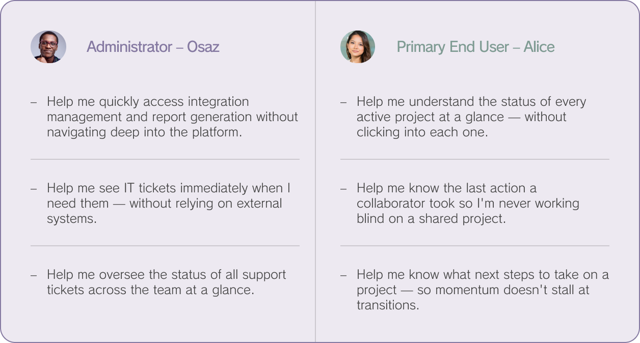
Turning problems into "Help me" statements.
I translated the heuristic findings into user-centered need statements — framing each problem as something the dashboard should be helping the user accomplish. This shift from "what's broken" to "what's needed" kept the design work grounded in real outcomes rather than aesthetic preference.
04
UI EXPLORATION & ITERATIONS
Exploring separately. Converging carefully.
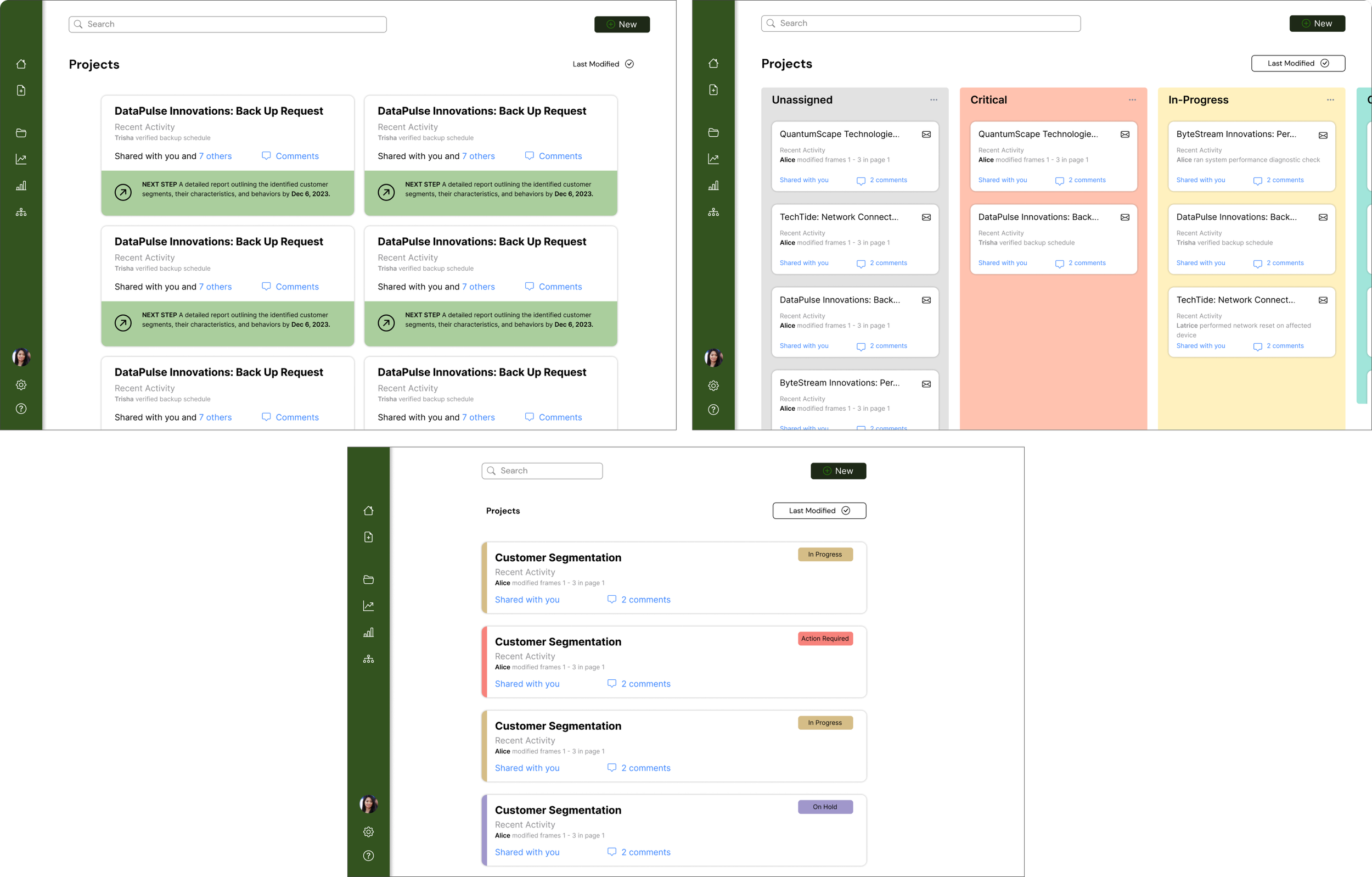
I explored the admin and end-user dashboards independently before attempting to unify them — because their needs, though related, are fundamentally different in rhythm and priority. Osaz lives in oversight mode; Alice lives in execution mode. One interface trying to serve both without distinction was part of the original problem.
After separate explorations, I consolidated the UI elements into a shared framework. That's when a critical flaw became visible.
Administrator Exploration
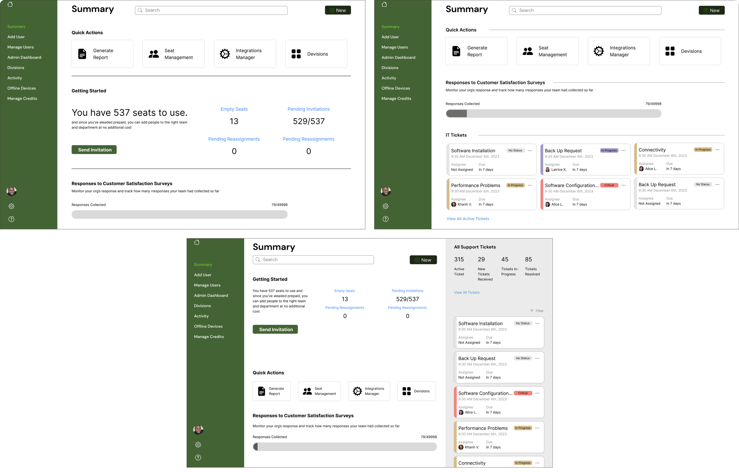
Primary End-User Exploration
05
RUNNING IT BACK
The first iteration wasn't enough.
Reviewing the consolidated design against the original heuristic evaluation revealed two shortcomings that the initial pass hadn't resolved. Rather than ship a design that looked unified but still failed users, I went back.
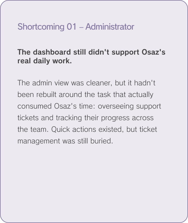
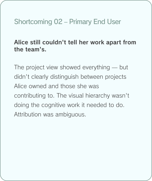
Shortcoming 1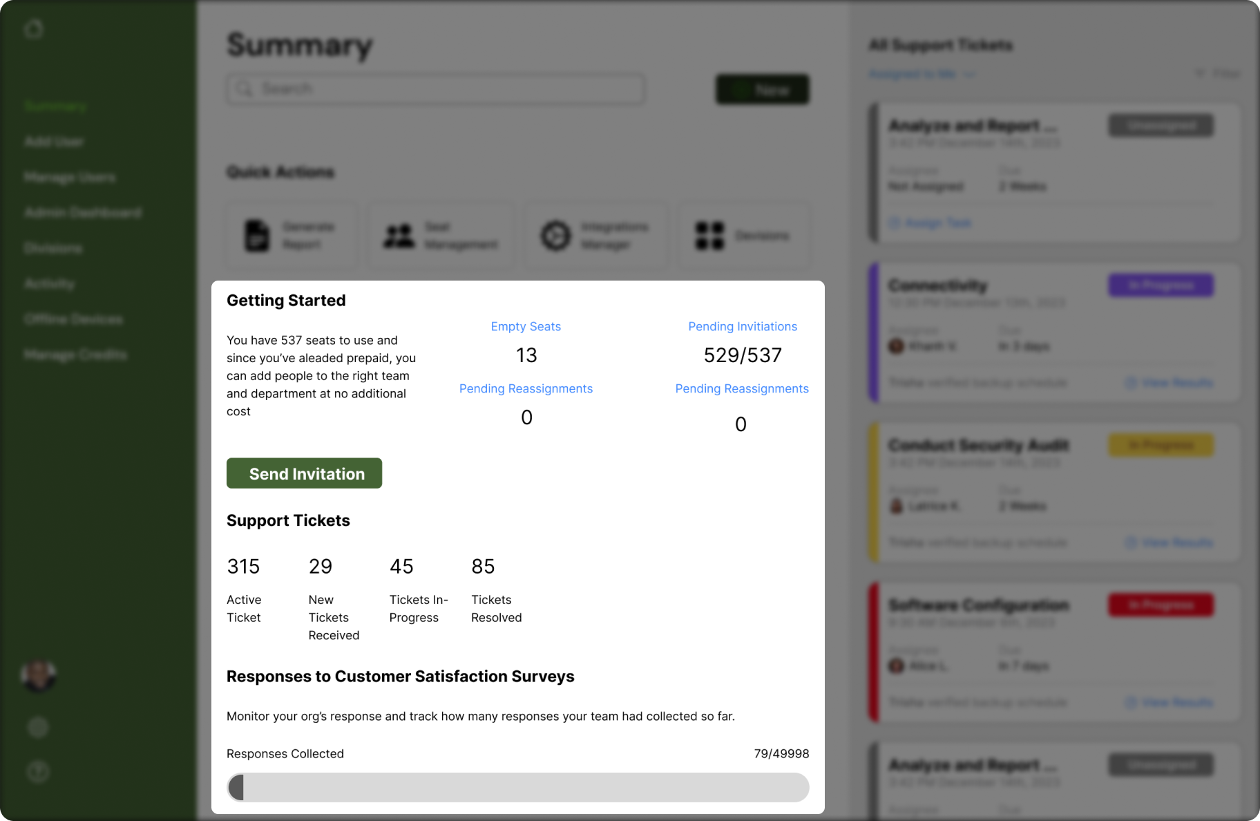
Shortcoming 2Going back wasn't a failure — it was the point. Catching this before shipping meant the final design actually solved the problem rather than just like it did.
06
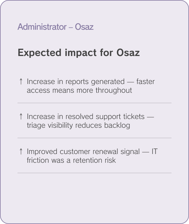
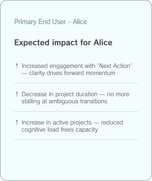
METRICS & OUTCOMES
Designing toward measurable results.
Every design decision traced back to the business's north star goals. The redesigned dashboards weren't built for visual coherence alone — they were built to move specific numbers.