
Developing an AI-Driven Last Mile Navigation
AMNAV
Bridging the gap in urban mobility by leveraging AI to provide safe, reliable, and barrier-free routing for users with accessibility needs.
Designer
Role
Peter Piczon
UX / Product Designer
Market
Type
Seoul South Korea
Academic Project
01 THE PROBLEM
For most people, opening a map app and heading somewhere new is effortless. For the 2.6 million Koreans living with disabilities — roughly 5.4% of the total population — it is anything but. A "wheelchair accessible" tag on a venue means very little when you don't know if the ramp is real, the restroom is actually usable, or whether your power wheelchair will run out of charge before you can find a station.
Getting around shouldn't require courage.
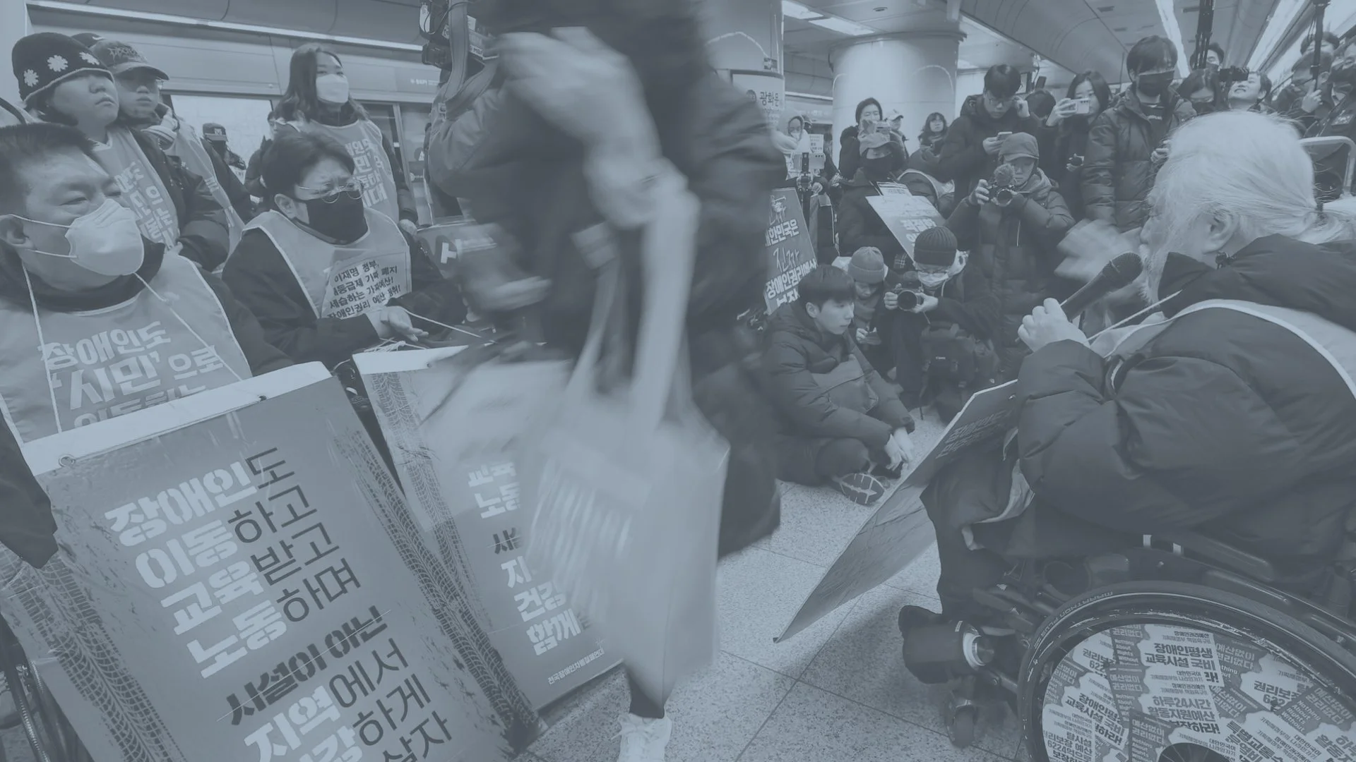
In 2022, protests erupted in Seoul's subway stations under the banner 장애인 이동권 보장하라 — "Guarantee Disabled Peoples' Rights to Mobility." The demonstrators weren't asking for something extraordinary. They were asking to get to work.
That tension — between a basic human need and a system not built to serve it — is where AMNAV begins.
Koreans living with disabilities — approximately 5.4% of the total population
2.6M
Koreans who perceive their society as discriminatory toward people with disabilities
65%
Koreans who report having significant difficulties accessing transportation
30%
02 THE OPPORTUNITY
Existing navigation apps — even the best ones — treat accessibility as a filter, not a foundation. They might surface an "accessible entrance" tag, but they won't tell you the elevator is broken, that the path requires navigating a 12% gradient, or that the only accessible restroom is on the third floor with no reliable lift.
A navigation gap hiding in plain sight.
For users with power wheelchairs, mobility aids, or limited physical stamina, these aren't inconveniences — they're trip-ending failures. The research question became clear: what would a navigation app look like if barrier-free routing were the default, not an afterthought?
AMNAV — Accessibility Map Navigator — is my attempt to answer that.
03 RESEARCH & PERSONA
Designing for spontaneity, not just survival.
I developed a primary persona to ground design decisions in a specific, human truth rather than a generalized "disabled user." The goal wasn't to design for limitation — it was to design for ambition.
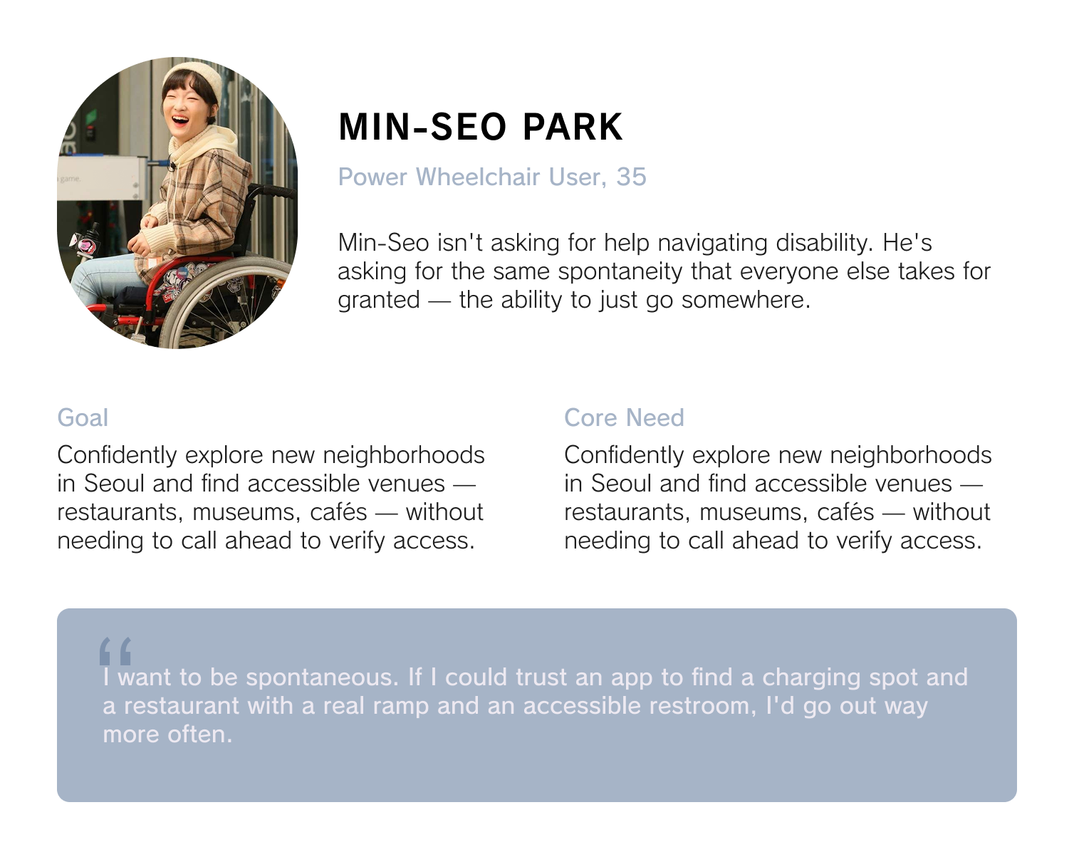
This framing shifted the entire design brief. The problem wasn't "make navigation accessible." It was: how do you design for trust? How do you build something a user will rely on when the cost of being wrong is being stranded?
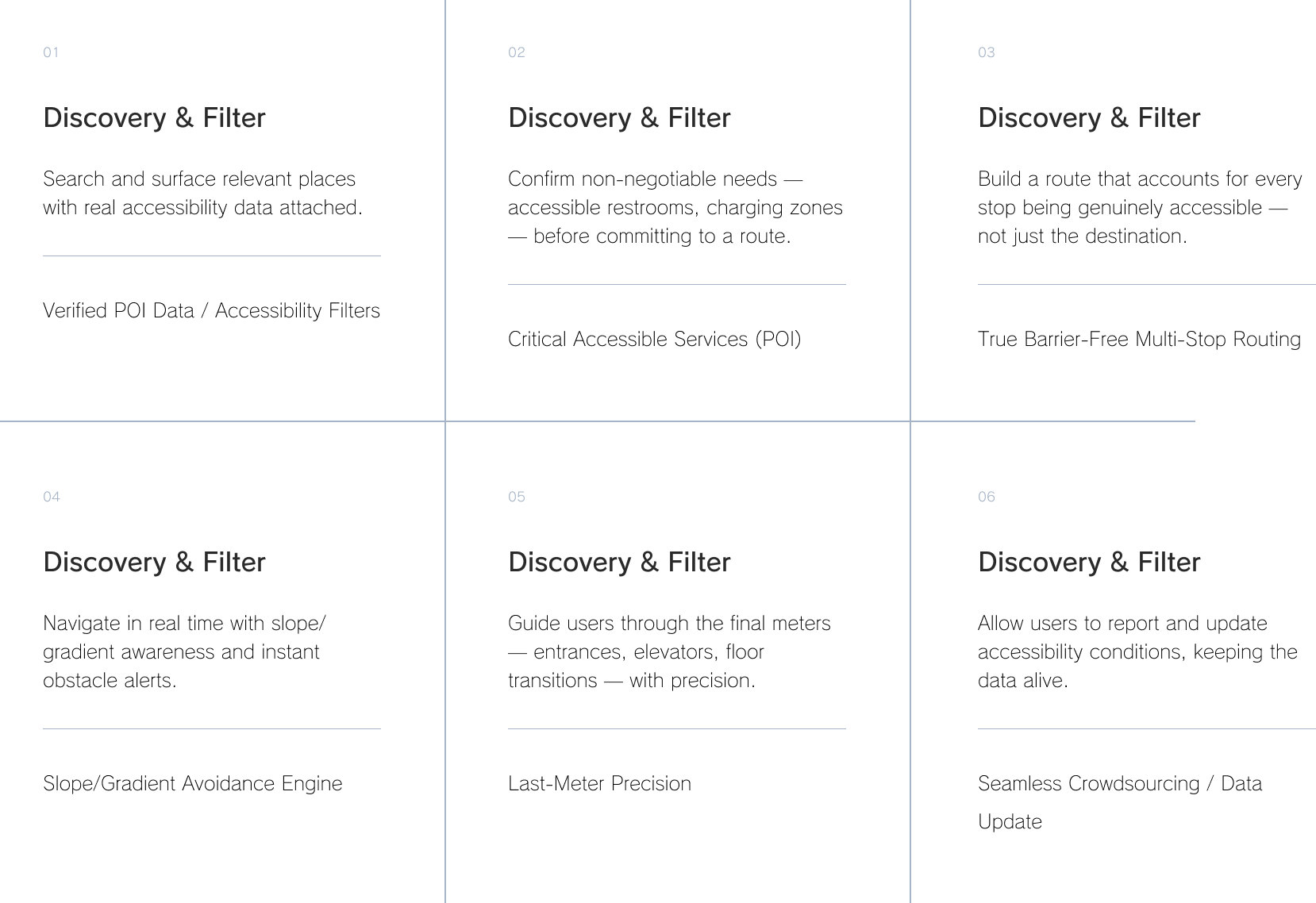
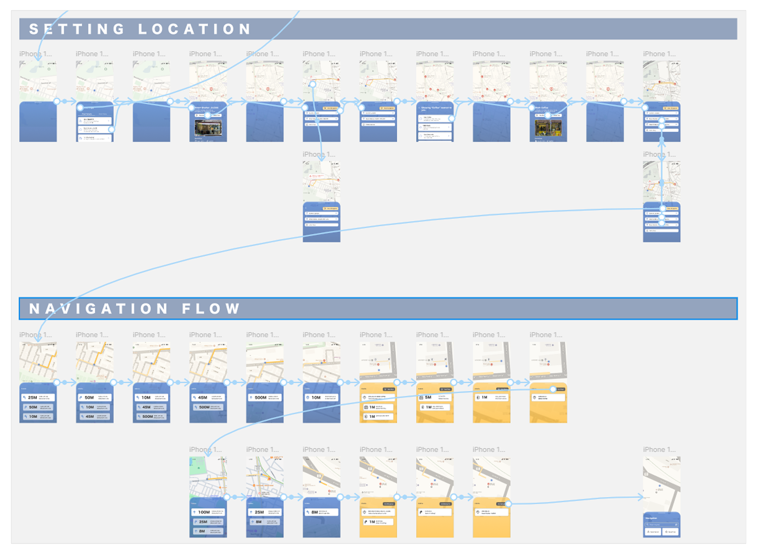
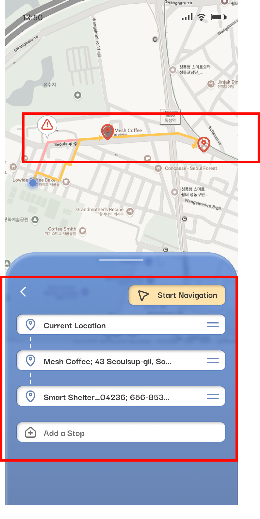
04 USER TASK FLOW & FEATURES
I mapped the end-to-end user task flow around a single scenario: spontaneously finding and navigating to a newly opened accessible café in an unfamiliar neighborhood — and ensuring a wheelchair charging station is nearby. Every feature maps directly to a moment in that journey.
Six moments that make or break the journey.
05 USABILITY TESTING & FINDINGS
What real users taught me the prototype got wrong.
Testing focused on three areas: hardware compatibility and AI routing accuracy, essential POI priorities, and core usability flows — onboarding, destination setting, active navigation, and the critical indoor transition. Two users surfaced findings that fundamentally changed the design direction.
FINDINGS – BARRIER AWARENESS
The icons were too small, and too generic.
Navigation icons need to be legible at a glance, often while a user is moving through unfamiliar terrain. The prototype used icons that worked on a design screen but fell apart in practice.
“The visual cues are too small for my eyes.”
– Auntie Bebe, test participant
“Icons must be recognizable at a glance while moving. These look generic — they could mean anything.”
– Wei Wu, test participant
DESIGN RESPONSE
Replace small decorative icons with significantly larger, high-contrast symbols. Adopt universal accessibility iconography rather than custom illustrations that require learning.
FINDINGS – BARRIER AWARENESS
The color-change mode shift caused confusion and anxiety.
When the app switched from outdoor to indoor navigation mode, the interface shifted from blue to a warm amber palette — a design choice meant to signal context change. Instead, it caused distress.
"The screen changed color — I thought I'd pressed something wrong."
– Auntie Bebe, test participant
"Users were confused and nervous when the map changed color at the entrance."
This was a significant finding. The indoor-outdoor transition is one of the most critical moments in last-mile navigation — it's where users are most disoriented, most dependent on guidance, and least forgiving of interface ambiguity. A passive color change was completely insufficient.
– Wei Wu, test participant
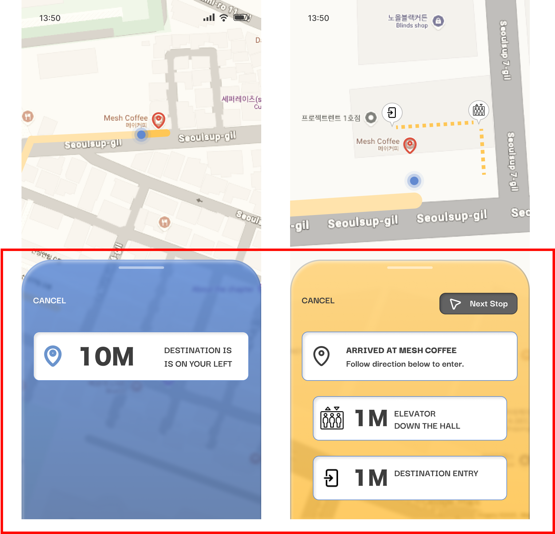
DESIGN RESPONSE
Remove the color-change mechanism entirely. Replace with large, explicit text confirmation — e.g., "You Are Inside Now" — displayed prominently when the navigation mode changes. Clarity over cleverness.
FINDINGS – NON-NEGOTIABLE SAFETY REQUIREMENTS
Three routing behaviors became mandatory, not optional.
Testing crystallized a set of requirements that couldn't be treated as feature enhancements — they were fundamental to the product's reliability and trustworthiness.
Mobility Filters: A "minimize inclines" route option is essential. All barrier-free routes must accommodate wheelchairs up to 70 cm wide.
Accessible Restrooms as Default: Restroom visibility must be a prominent, always-present feature — not buried in filters.
Dynamic Obstacle Rerouting: Warnings must be immediate, audio-visual, and undeniable. Subtle UI nudges are not enough when a blocked ramp means a user has no path forward.
06 REFLECTIONS
AMNAV pushed me in ways I didn't anticipate. Designing for accessibility isn't a constraint layer you add on top of a product — it requires rebuilding assumptions from the ground up. A few things I'm still sitting with:
What I'd do differently — and where this goes next.
The indoor transition failure was a reminder that the most consequential design moments are often the quietest ones. I want to map every mode-change, state-change, and context-shift in the app and pressure-test each one with users who rely on explicit cues rather than implicit ones.
Refine the Base
The prototype relied heavily on mocked data. The next phase would integrate real-world routing APIs, open government accessibility databases, and a live crowdsourcing layer to test whether the data model holds up against the messiness of actual Seoul infrastructure.
Implement Relevant APIs
The app's current scope centers on individual navigation. But there's a larger opportunity: if enough users contribute data, AMNAV becomes a real-time accessibility map of Seoul — infrastructure intelligence that city planners, transit authorities, and businesses could act on.
The protest chant I opened with — 장애인 이동권 보장하라 — isn't just a political slogan. It's a design brief. AMNAV is one attempt to respond to it. There's still a lot of work to do.